Louis Kahn once described books as being visible only in light of the libraries that house them. For Houston-based studio MG&Co, this relationship between work on paper and in the built environment is a guiding interest.
Partners Noëmi Mollet and Reto Geiser have become known for taking on projects that range intentionally in scale from books to small-scale architectural projects, each one investigating the boundaries between architecture and installation, and academia and practice (Geiser is on faculty at Rice University).
Geiser describes their work as “positioned at the intersection between architecture and design: between two and three dimensions, in a way,” since the studio not only edits words and ideas, but designs the books, spaces, and systems with which they are communicated.
MG&Co.’s projects tend to confidently cross the disciplinary lines that typically separate architects themselves from the editors, publishers, curators, and exhibition designers who frame their work for public audiences. The practice has acted its own publisher, designed graphic identities for other architects, and curated exhibitions depending on the setting.
At the Biennial this fall, Mollet and Geiser are expanding their interest in architectural bookmaking with a multidisciplinary project that connects multiple book collections and involves the public in deciding how to approach them at different scales.
“The project started off with knowing there would be a bookshop at the Biennial, so we decided to expand this notion of the place where we buy books, to an environment in which you can actually think about the relevance of books to architecture and history, and look at them in a different way,” Geiser said.
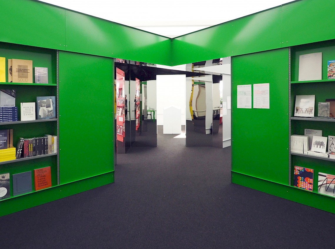
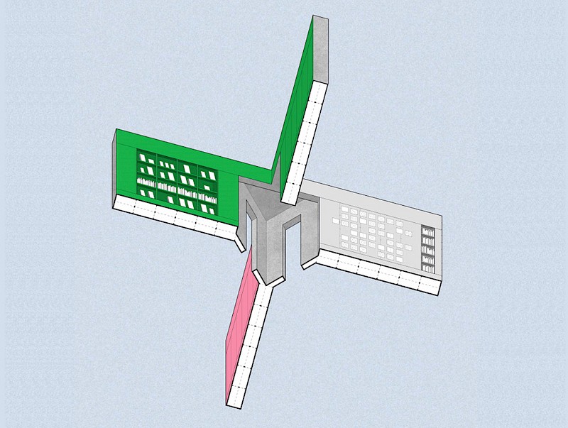
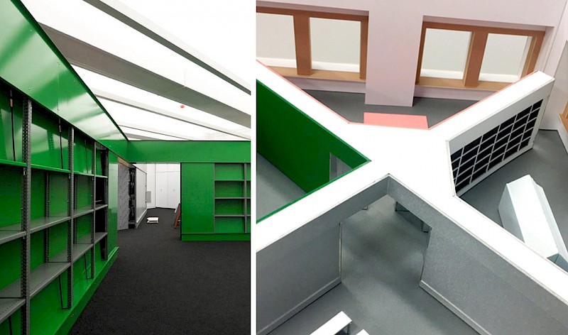
The design of the project, entitled Rooms for Books, divides a single gallery into four distinct spaces in dialogue with one another. The store that Geiser mentions is a satellite of the Graham Foundation Bookshop, which offers works by Biennial participants as well as hard-to-find design titles from around the world. Bright green and filled with books for sale, this section reflects one way to navigate the vibrant publishing landscape.
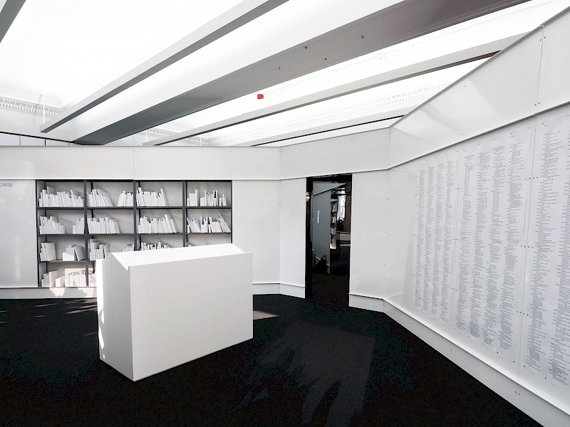
Standing in contrast to the store is a reference room adjacent to it. For this space, Mollet and Geiser gathered over 400 titles from Biennial participants, re-covered them in white dust jackets, assigned them call numbers, and referenced them through and extensive index. The reference room is equipped with lecterns and a photocopier, should visitors want to take home something they find interesting.
“We wanted to treat all participants equally and take the marketing aspect of book covers out [in this space] and to create a really calm, focused environment. There is also an architectural aspect to it: you start to understand books through their proportion, rather than their graphic appearance.”
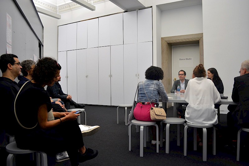
The most participatory of the rooms is the quadrant dedicated to programming, which acts as a platform for discussion around the different topics represented within the Biennial and on architectural publishing itself. During the Biennial’s opening weekend, the space hosted ‘On the Architecture of Books,’ a series of hourly conversations in which curators, photographers, artists, architects, and publishers gathered to offer different perspectives on the architectural book today. Last Sunday, with the Biennial open to the public, visitors could drop in while participants signed books available in the shop and discussed their projects in an intimate setting.
Public programming will continue in the Rooms for Books throughout the Biennial, including lectures, roundtables, interviews, smaller presentations, which will themselves be eventually translated into printed matter.
Geiser and Mollet deliberately decided not to include a digital component.
Geiser explains, “we are interested in the shift from print to screen, but in the context of an exhibition, it did not make sense to us to remove the book’s physical presence. That said, the question of why some publications should exist as books and why others are better suited to a digital format is important and will be part of the conversations held in our space.”
Exploring Rooms for Books remains a physical experience, heightened by moving from the lively bookshop to the calm, white reference space, for example, and by the dramatic partitions connected by a mirrored space.
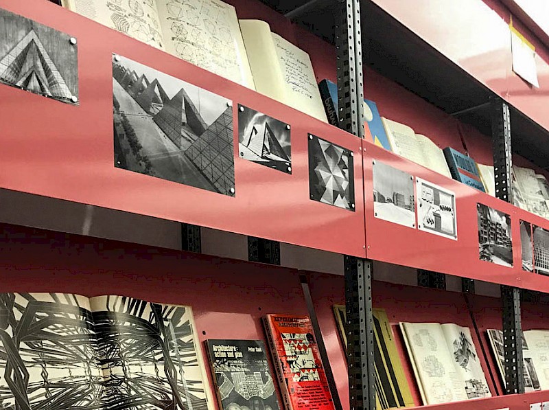
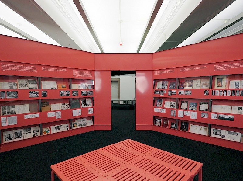
The final element of the installation investigates the link between publication and architectural practice itself, exhibiting a selection of books from the library of Chicago architects Stanley Tigerman and Margaret McCurry. Formerly the Director of the School of Architecture at University of Illinois at Chicago, Tigerman took a similar interest to Mollet and Geiser in the physical dissemination of ideas in architecture over the course of his career, and the negotiation between design and theory. In keeping with this commitment and interest, Tigerman and McCurry donated their library to the Graham Foundation earlier this year.
“Tigerman and McCurry stressed that this is a working library, and [this display as part of Rooms for Books] is a first attempt at unpacking these volumes.” The antique pink of the space again aims to differentiate it from the adjacent rooms, as well as references a 1970s exhibition of Tigerman’s that presented all of his drawings in the same shade of blush.
Picking up on threads that run through MG&Co.’s past practice, the project is in some ways reminiscent of Ai Weiwei's “Five Houses” exhibition, which Geiser curated at the Architecture Center in Houston. Creating a “fully-designed environment,” here MG&Co. again had the opportunity to think through every aspect of an installation; from the smallest objects to the larger visitor experience in the built work.
On the smaller end of this scale, Mollet and Geiser’s approach to publishing and typography has not gone unnoticed, and their most recent book, “House is a House is a House is a House is a House: Architecture and Collaborations of Johnston Marklee” (Birkhauser, 2016) was awarded as a winner in AIGA’s 50 Books | 50 Covers competition last year. They have continuously used compelling publication design as an argument against the prevailing assumption that print media is on its way out.
For their practice, the book remains the most effective platform for advancing interdisciplinary architectural thought and reaching a wide, public audience. With “Rooms for Books,” each room within the installation should offer a unique context for these audiences to consider the printed history of the Biennial’s projects and think broadly about each one in a wider cultural context.
For an overview of how to explore the Biennial's exhibitions and programs, click here.
Explore the architecture of books further in the Biennial’s Are.na channel below. You can add your own ideas to this channel by joining Are.na.


